
Introduction
Tesla, a leading company in the electric car industry known for its high-end offerings, has a large infotainment system as a key feature in its premium vehicles. It's important to note that any problems discussed here might have been resolved or changed in later updates, highlighting Tesla's commitment to continually improving and advancing their technology.
The Challenge
How can we enhance Tesla's native navigation system to provide a more user-friendly and feature-rich experience comparable to leading rivals?
What does users say ?
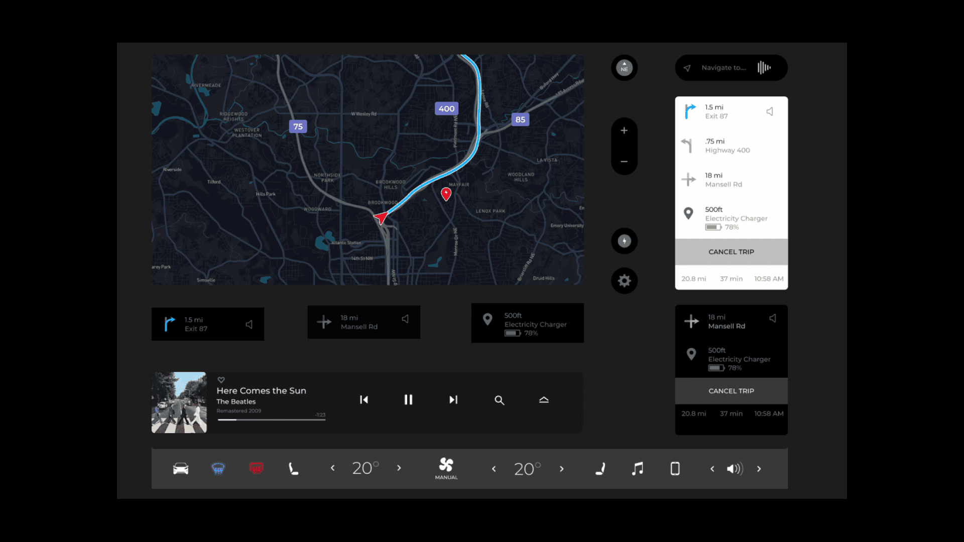
The initial phase of my research involved exploring Tesla's navigation application by engaging with Tesla owners. I gathered their insights and requested visual representations of their infotainment systems, focusing on the Navigation User Interface. This approach allowed me to closely examine and analyze the user experience.
"
Continues to highlight the covered path and confuses the user regarding the navigated route.

Conceptualize
The Ideate phase began with brainstorming ideas for redesigning the Infotainment system, informed by data from primary and secondary research. This analysis helped me understand user pain points and challenges, positioning the project to address these issues and deliver a user-centric, improved Infotainment system.
"
The main emphasis was on enhancing usability through a careful redesign of the navigation system.

Redesign
Auto Light and Dark mode using Figma Variables
I implemented light mode and dark mode components seamlessly within a single screen using color variables in Figma. This approach significantly reduces the effort required to design and maintain separate light and dark interfaces, ensuring a consistent user experience across different visual preferences.


Impacts
Familiar UI: Users found the UI to be familiar, contributing to ease of navigation and enhancing the overall user experience.
Engaging Animations: Participants expressed interest in the engaging and visually appealing animations incorporated into the design.
Path Representation: Participants highlighted how the redesigned navigation app effectively depicted the covered path, addressing a significant user pain point.

